Understanding Highcharts Grid
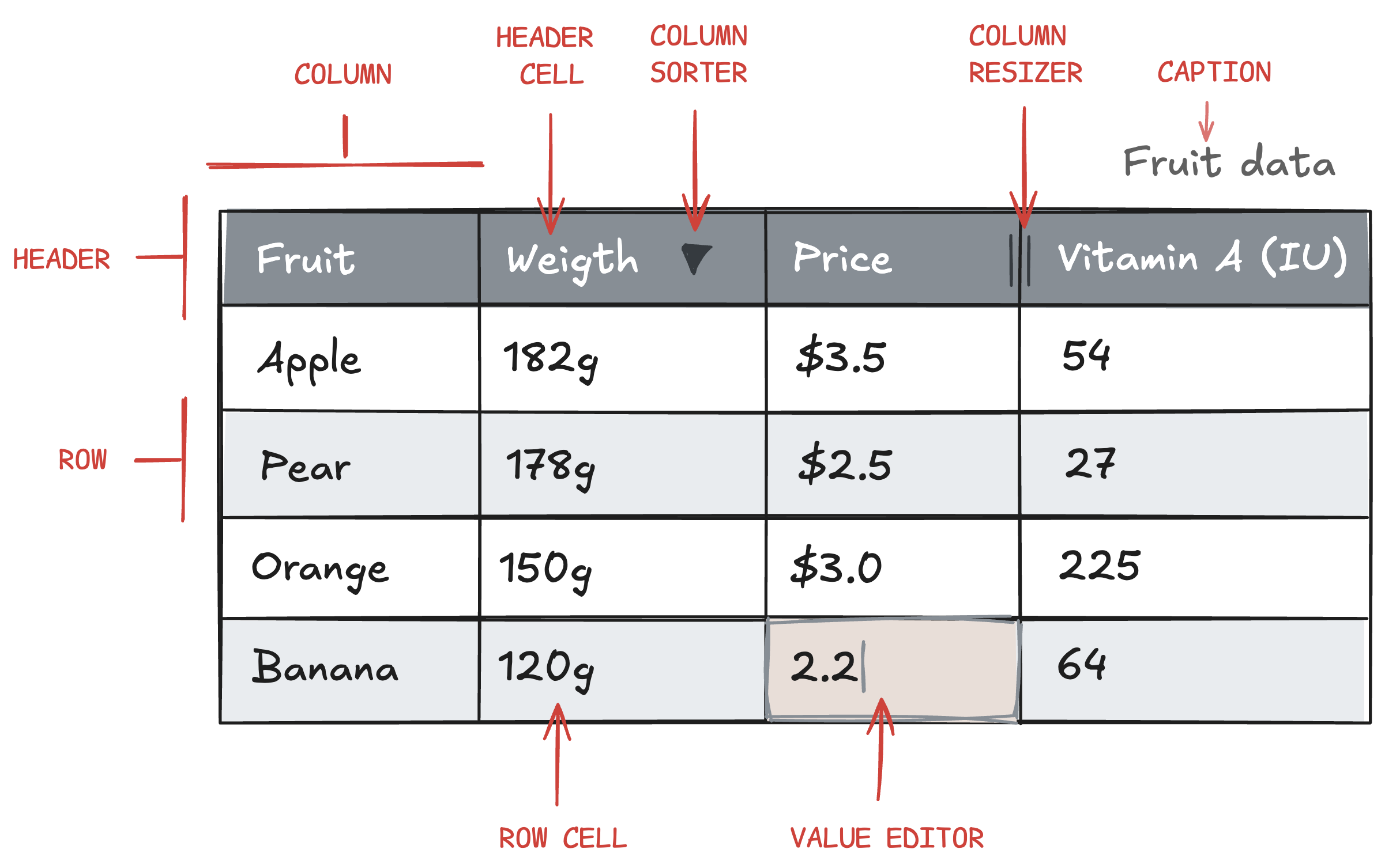
At its core Grid consists of a data source that is rendered in x number of columns and rows. Many of the available configuration options applies to the columns and their corresponding row and header cells.
The following provides an introduction to the various root configuration objects in Grid:
dataTable
{
    dataTable: {
        columns: {
            product: ["Apple", "Pear", "Orange", "Banana"],
            weight: [182, 178, 150, 120],
            price: [3.5, 2.5, 3, 2.2],
            vitamin_a: [54,27,225,64]
        }
    }
}
The dataTable object is the only required option for proper rendering of Grid, and dataTable.columns creates an instance of the DataTable class. This class has key-value pairs, where the key is used for the header cell, and the value is an array of values for the corresponding row cells.
Read more about data handling and the DataTable class .
Data modifiers
Alternatively to serializable options, you can pass a reference to the DataTable you want to use when rendering the Grid. This lets you, for example, apply a Math Modifier from Highcharts Dashboards library to it beforehand to add a new column whose values are the result of a mathematical operation on one or more existing columns.
You can read more about Data Modifiers here .
columnDefaults and columns[]
{
    columnDefaults: {
        cells: {
            editMode: {
                enabled: true
            }
        }
    },
    columns: [{
        id: "weight",
        header: {
            format: "Weight"
        },
        cells: {
            format: "{value}g",
            editMode: {
                enabled: false
            }
        }
    }, {
        id: "price",
        header: {
            format: "Price"
        },
        cells: {
            format: "${value}"
        }
    }]
}
The ’ columnDefaults ’ object defines default options for all columns in the grid, such as the column sorter, column resizer, value editor, cell format, etc., and the columns[] array of objects can be used to override defaults in selected columns if needed. Note that most options in columnDefaults are mirrored 1:1 in the columns[] array of objects.
Learn more about columns[] in our Columns article or see the API reference for columnDefaults and columns[] .
caption
{
    caption: {
        text: "Title of the Grid";
    }
}
The code snippet above shows how to insert a caption, or title, above the grid.
For more information on the caption option, see the API reference .
header[]
{
    header: [
        {
            columnId: "product"
            format: "Fruit",
        },
        "weight",
        "price"
    ]
}
While the format and visibility of individual columns and their header cells can be set using the columns[] option, the same can be achieved using the header[] root option. Which option to use depends on your specific use case, and header[] will, in some cases, be less verbose than columns[].
In addition, the header[] option can change the order of headers and group headers in a hierarchical structure.
The Header article provides more information about header[].
accessibility
{
  accessibility: {
    enabled: false,
    ...
  }
}
The accessibility option object can be used to enable/disable accessibility features such as ARIA attributes and ARIA live announcements.
For more information on accessibility options read our documentation article on accessibility .
lang
To customize the default language or wording for ARIA attributes and announcers, use the lang.accessibility option. In the current version of Highcharts Grid the lang option is solely related to accessibility , but will be extended to other use cases as we add more features. Stay up to date by visiting our changelog and roadmap .
rendering
The rendering option object can be used to configure options related to performance and the rendering of the Grid. Example: Rendering.rows represents the rows in the Grid.
{
    rendering: {
        rows: {
            bufferSize: 5,
            strictHeights: true
        }
    }
}
For more information on rendering options, please read our article on Performance and rendering or see the API reference .
events grid_pro
Highcharts Grid Pro supports several event listeners that can be added to the header, columns and cells. These provide custom functionality and extendibility of Grid. Read more about events in the Events article .
setOptions()
When adding multiple grids to the same page, it is recommended to set default options globally using the setOptions() method. This approach is more efficient than configuring each Grid individually. For an overview of all default options see the API reference .
Grid.setOptions({
    columnDefaults: {
        sorting: {
            sortable: false
        }
    }
})
This example disables end user sorting for every Grid on the page.