Layout
Overview
The positioning of its components is an essential part of any dashboard. The layout can initially be defined from the configuration object and then changed when Edit mode is enabled. Here are the building blocks of a dashboard layout.
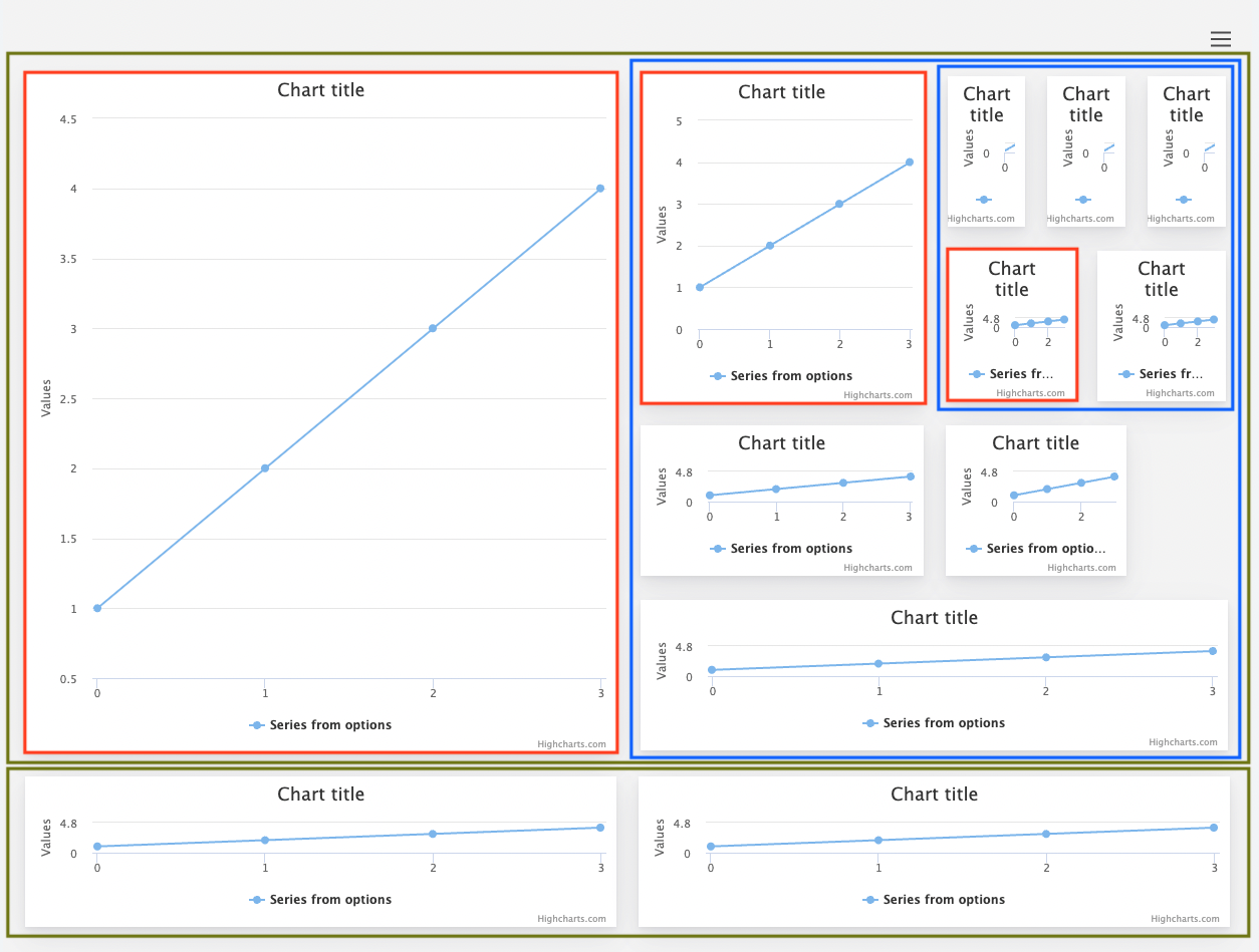
- Green boxes: rows
- Red boxes: individual cells
- Blue boxes: nested layout inside a cell
To use Dashboards with a layout system and edit mode, you first have to load the layout module.
<script src="https://code.highcharts.com/dashboards/dashboards.js"></script>
<script src="https://code.highcharts.com/dashboards/modules/layout.js"></script>
Alternatively, you can download the NPM package like
npm install @highcharts/dashboardsand import it in your project like:
import * as Dashboards from '@highcharts/dashboards';
import LayoutModule from '@highcharts/dashboards/modules/layout';

LayoutModule(Dashboards);
If you use ESM, you can also import the modules directly from the package:
import Dashboards from '@highcharts/dashboards/es-modules/masters/dashboards.src.js';
import '@highcharts/dashboards/es-modules/masters/modules/layout.src.js';
Rows
Each layout consists of at least one row, which spans the entire width of the outer layout it’s defined in. Using Edit mode, you can change the row’s width and height and resize the cells inside it. Each row can have its own style defined, and its cells can be defined as a JS object or a JSON.
Cells
Each row consists of at least one cell, but there can be many cells in the same row. These cells are the containers for the components or the nested layout.
Nested layout demo
How the dashboard layout engine makes your dashboard responsive
The layout calculates the position of the components. Generally, each row is placed in columns, and cells are placed in rows. When dealing with the resizer module, things get more complicated, which lets you change the width and height of the row and cell. The dashboard layout engine is based on Flexbox, and by setting width and height in percentage values, cell and row sizes are adjusted dynamically when the outer container resizes. This can happen in nested layouts when several rows are positioned inside a cell, which can also be resized.
Use regular CSS media queries to adjust your layout to different screens.
Example:
/* LARGE */
@media (max-width: 1200px) {
    #dashboard-cell-1 {
        flex: 1 1 33.333%;
    }
}

/* MEDIUM */
@media (max-width: 992px) {
    #dashboard-cell-1 {
        flex: 1 1 50%;
    }
}

/* SMALL */
@media (max-width: 576px) {
    #dashboard-cell-1 {
        flex: 1 1 100%;
    }
}
Instead of regular CSS media queries, you can also use container queries , which will make more sense if your dashboard does not cover the entire window horizontally. See a demo that uses this .
Example:
/* Create a containment context */
#container {
    container: dashboard / inline-size;
}

/* LARGE */
@container dashboard (max-width: 1200px) {
    #dashboard-cell-1 {
        flex: 1 1 33.333%;
    }
}

/* MEDIUM */
@container dashboard (max-width: 992px) {
    #dashboard-cell-1 {
        flex: 1 1 50%;
    }
}

/* SMALL */
@container dashboard (max-width: 576px) {
    #dashboard-cell-1 {
        flex: 1 1 100%;
    }
}
Custom layout
If you prefer to use your custom layout structure, feel free to do so. The only thing you need to do is disable the GUI by option. Also, the layout.js module is not needed then. Please remember that each container should have a unique id for the rendered component.
    gui: {
        enabled: false
    },
    components: [{
        renderTo: 'dashboard-col-0',
        type: 'Highcharts',
        chartOptions: {
            chart: {
                type: 'pie'
            },
            series: [{
                data: [1,2,3]
            }]
        },
    }]
Here is the standalone demo and the tailwind demo .
*NB! Disabled gui does not allow you to use the Edit Mode module.