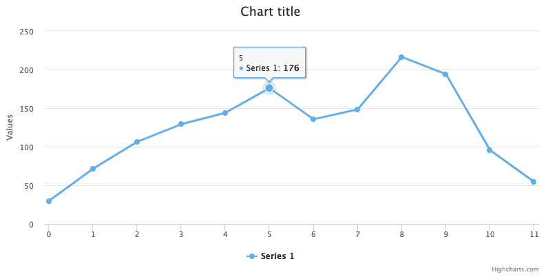
Tooltip
The tooltip appears when hovering over a point in a series. By default the tooltip shows the values of the point and the name of the series. For the full set of options available for the tooltip, see the API reference .
Appearance
The following code example shows the most common appearance options for tooltip:
tooltip: {
    backgroundColor: '#FCFFC5',
    borderColor: 'black',
    borderRadius: 10,
    borderWidth: 3
}
The background color can also be set to a gradient, see an example . Text properties can be set using the style option.
Alternatively, the tooltip can be styled with CSS by enabling styled mode :
.highcharts-tooltip-box {
    fill: #FCFFC5;
    stroke: black;
    stroke-width: 3;
}
Note: Since the tooltip content is rendered as SVG by default, you have to specify SVG properties such as fill and stroke in CSS.
Tooltip formatting
The tooltip’s content is rendered from a subset of HTML that can be altered in a number of ways, all in all giving the implementer full control over the content. In addition to options on the tooltip configuration object, you can set the options for how each series should be represented in the tooltip by series.tooltip .
- The header part of the tooltip can be altered using the tooltip.headerFormat . In a shared tooltip, the first series’ headerFormat is used.
- The listing of each series is given in the tooltip.pointFormat option, or an individual pointFormat for each series.
- The footer part can be set in the tooltip.footerFormat option.
- All the options above can be overridden by the tooltip.formatter callback for programmatic control.
By default the tooltip only allows a subset of HTML because the HTML is parsed and rendered using SVG. By setting the useHTML option to true, the renderer switches to full HTML, which allows for instance table layouts or images inside the tooltip.
tooltip: {
    format: 'The value for <b>{x}</b> is <b>{y}</b>, in series {series.name}'
}
For more info about formatting see Labels and string formatting
Positioning
Highcharts offers several options to tailor tooltip positioning to your needs, improving both functionality and design.
- Shared tooltips are great for charts with multiple series. A single tooltip displays information for all series at a specific x-axis value, reducing clutter and making comparisons easier. See tooltip.shared .
- Split tooltips display separate tooltips for each series point, which can be useful when detailed information for each data point is needed. See tooltip.split .
- Fixed tooltips (since v12.2) display the tooltips in a fixed position on
the chart - by default the top left corner of the data pane. Fixed tooltips
can be combined with
sharedorsplit. See tooltip.fixed .
Crosshairs
Crosshairs display a line connecting the points with their corresponding axis. Crosshairs are disabled by default in Highcharts, but enabled by default in Highcharts Stock. See the full set of options for crosshairs .
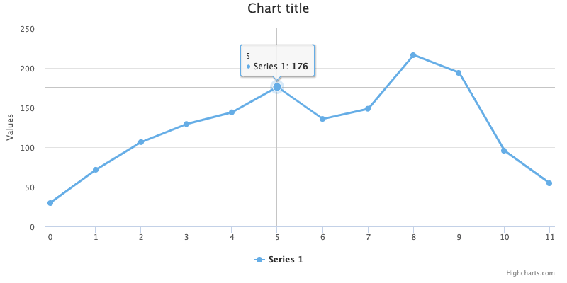
Crosshairs can be enabled for the x-axis, y-axis or both:
// Enable for x-axis
xAxis: {
    crosshair: true
}

// Enable for y-axis
yAxis: {
    crosshair: true
}