Waterfall series
A waterfall chart is a form of data visualization that helps in determining the cumulative effect of sequentially introduced positive or negative values. The waterfall chart is also known as also known as bridge, especially in finance, or a flying bricks chart due to the apparent suspension of columns in mid-air. Waterfall charts are commonly used in financial reports to display changes in revenue or expenses over periods, showing how each factor contributes to the overall result.
Defining the points
Defining the points in a waterfall is pretty straight forward. Each point is accumulated on top of the next, or subtracted from the sum if it is negative. The most intuitive way of defining a series is to give each point a name and an Y value, and set xAxis.type to “category”. A live demo can be seen at www.highcharts.com/demo/waterfall .
Furthermore, a waterfall series has two kinds of automatically computed columns. These points don’t have an Y value, only a flag that specifies their type:
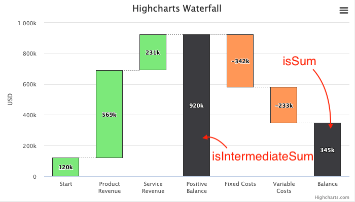
isIntermediateSumWhen this property is true, the points acts as a summary column for the values added or subtracted since the last intermediate sum.isSumWhen this property is true, the point display the total sum across the entire series.
Sample code:
data: [{
    name: 'Start',
    y: 120000
}, {
    name: 'Product Revenue',
    y: 569000
}, {
    name: 'Service Revenue',
    y: 231000
}, {
    name: 'Positive Balance',
    isIntermediateSum: true,
    color: '#0066FF'
}, {
    name: 'Fixed Costs',
    y: -342000
}, {
    name: 'Variable Costs',
    y: -233000
}, {
    name: 'Balance',
    isSum: true,
    color: '#0066FF'
}]
Colors
The up and down points can be colored separately through the color and upColor properties. Sums and intermediate sums have no specific colors, but these columns - as any column - can be colored by individual color settings.